«Back ·
Tracking: {
'Country Code': 'US',
'Language Code': 'EN-US',
'Email Hash': 'unknown',
'Vendor User Id': 'unknown',
'Vendor Id': 'unknown',
'Customer Type': '',
'Offer Code FONT Download


 Designer:
 Frode Helland
Publisher: Indian Type Foundry
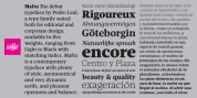
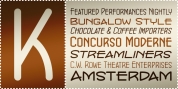
Indikator is a family of humanist-style sans serif fonts. There are five weights in the Indicator family; these range from Light through Bold. Each weight has both an upright as well as an italic font on offer. The italic fonts contain slanted, or oblique-style letters. The letters in each of Indikator's weights appear virtually monolinear, in terms of stoke contrast. Strokes end in either horizontal or vertical cuts, rather than in diagonals. The fonts have a large x-height, and the lowercase letters' ascenders are taller than the heights of the capital letters. Indikator's numerals are tabular lining figures; these are just as tall as the fonts' uppercase. The fonts' OpenType features include alternate forms for the 'I', 'J', '4', 'i', and 'l' – as well as a more Scandinavian version of the 'Å'. There is also an alternate version of the zero, with a slash running through its counter. Indikator had a lot of character and verve than many other humanist sans serif families. It feels a little 'old-timey,' like it is channeling design ideas from the first half of the twentieth century, rather today's Silicon-Valley-style designs. Indikator is an excellent selection for use in corporate communication or editorial design work. It will surely also come to good use in publications about contemporary culture and lifestyle issues. Indikator is the work of Frode Helland, a type designer from Norway.